Binary parameters are used to filter queries. They are simpler than a standard slicer, allowing the discovery user to perform a "switch-like" action to toggle the filter on or off rather than offering many options. You can use the Formatting panel to set styling preferences for the toggles and customize their title (text, styling, and position), title icon, and colors. This gives you the flexibility to apply your own styling or make styling changes in accordance with your organization's branding.
- Click here to learn about the Formatting panel.
Formatting effect at runtime
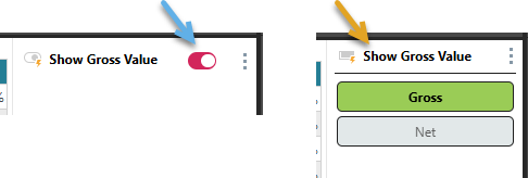
Binary parameters are most typically "toggles" (blue arrow below); these are sliding switches or "pill-shaped" buttons that allow you to enable and disable a parameter. Binary parameters can also be dropdown lists, list and text boxes, and buttons (orange arrow), each with just two options for selection:
Access Binary Parameter Formatting
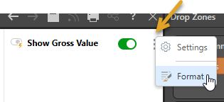
Binary parameters are formatted using the Formatting panel. You can open the Formatting panel by opening its context menu (orange arrow) and clicking Format:
Where the binary parameter is a toggle, the formatting details are as described below. Other types have similar settings to other slicers.
Toggle Formatting Panel
The Toggle Formatting panel comprises two tabs, allowing you to edit formatting for the Title and Settings (Colors). If your Binary Parameter is not a Toggle (it is visualized as a dropdown list or pair of buttons, for example), then the Formatting panel contains the same options as those used for slicers. For more information, see Slicer Formatting.
Slicer Title
When formatting your toggle, the Slicer Title tab allows you to apply formatting changes to the title, without affecting any other components:
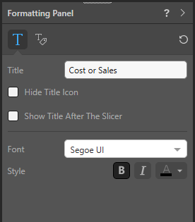
Title
Overwrite the slicer's current title.
Tip: A new slicer's title defaults to the name of its underlying hierarchy or parameter. You can override this value manually or enable Auto Title in the Slicer Settings to keep the slicer's title automatically in sync with changes to the hierarchy or parameter name. For more information, see Binary Parameter Settings in Discover Pro.
Hide Title Icon
By default, a title icon is located next to the title indicating the current slicer type. Select the Hide Title Icon checkbox if you don't want to display the icon.
Show Title After The Slicer
Select the Show Title After The Slicer checkbox to position the title after the slicer widget. For example, selecting this checkbox means that the title "Cost or Sales" is shown after the sliding switch.
Font
- Font: Change the font type for the slicer title.
- Style: Change the font style for the title; bold, italics, or color (set using the Color Picker).
Settings
When formatting your toggle, the Settings tab shows formatting options relating to the "mode" that the toggle is in:
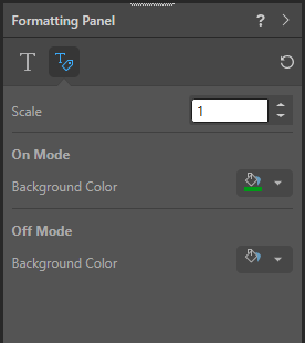
Scale
Scale the sliding switch. This can be a value between 1 and 2, indicating that the button should be the standard size (1), double that size (2), and somewhere in between (say, 1.2).
Background Color
Use the Color Picker to indicate the color that should be applied to the sliding switch when it is in either On Mode or Off Mode.
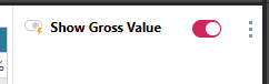
This is the color of the oval containing the sliding switch. For example, setting the Background Color under On Mode to pink makes the enabled toggle appear as follows:
Tip: Use vibrant colors to make toggles "light up," visually indicating that they are selected. Use neutral tones such as gray for the deselected state to create a clear visual contrast.
Reset
 Click Reset at the top-right of the Formatting panel to reset all formatting back to the defaults.